December 19, 2021 - 10:00 PM
Hi everyone, I’ve finally launched my brand new personal website, welcome to Shiny’s Hideout! I’ve been working on this for the past week as a replacement for my old website, which didn’t really do anything useful and just had a few social links. It was also very boring-looking, because it just had an extremely basic Material Design style without any additional theming.
This new site is heavily inspired by my favorite era of the web, from the late 90s to the early-mid 2000s, specifically the kind of personal websites where everyone put their own sort of style into them. Even more professional websites often had a great look to them, and my new website is certainly also inspired by some of those, like the late 90s IGN. But I also have a huge soft spot for old fansites, and I even have some ideas for throwing together some small fansites of my own out of love for the old fansite internet.
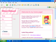
This website is also fully compatible with Internet Explorer 6, in a very 2000s fashion! I haven’t tested it in any versions of Netscape yet, but Netscape support isn’t a huge priority, especially since IE had largely won the browser war by that point. The site also doesn’t use any JavaScript at all! Well, at least for now, I have no idea if some weird thing I decide to do in the future will need it.
The site is written by entirely by hand in XHTML 1.0 and CSS, and I’m making sure to run every page through W3C’s validators, as you can see by the badges I’m a little too happy about displaying at the bottom of the page. I might be cheating a little though, because while all of the individual body pages validate just fine, the sidebar page has a few issues. I hope to figure those out eventually!
Nostalgia, mostly... there’s a lot of websites I used to browse as a kid in the 2000s that I have a lot of nostalgia for, and I really want to make a website that captures at least a little of what was really nice about the internet from back then. The site’s also something of a design challenge for me, because it’s a kind of UI design I’m very much not used to, and on top of that, I’ve been taking a completely different approach to how I write for this site. I’m used to a modern sort of “professional” UI writing style that has very little personality, so for this site I’m going for the complete opposite, I want this to be as casual as possible!
This site is also a bit of an exploration of my identity, to be honest? I feel like documenting more about myself might help me figure out more about who I am, you know what I mean? I really hope that doesn’t sound weird! A lot of the writing on this site is intentionally going to be casual and free-flowing, sometimes it's literally just going to be myself pouring my thoughts on a page with little editing.
Oh yeah sorry, I’m getting ahead of myself... for now, this site is starting out with the home page, which is both a bio for myself as well as a collection of social links, and serves as the launching-off point for the other pages on my site. But, on top of the home page, the site now also has this handy little blog, and I might even end up using it! I might use it to document various projects I work on going forward, and I’ll certainly be using it to announce new major updates and changes to the site when necessary. New entries will listed on the home page, and they'll all be available from the blog index.
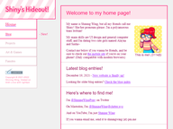
In the meantime, here’s some pictures of what the new site looks like! In most cases, when you see a thumbnail for a picture, you’ll be able to click it to load the full-size image, and the full file size will be listed alongside it.
 |
 |
|---|---|
| The new site! (65kB) | The new site in IE6 (92kB) |
As a rule of thumb, if a file size is listed, it’s always referring to a full-size image you can click to view. Certainly an old-fashioned approach, but I like doing things this way, and I hope stuff like this makes you feel a little bit of nostalgia too! And who knows, maybe my approach to size reduction might make things easier to view for anyone with slow internet who happens to be looking at my site?
I plan on setting up the Projects page as well as hopefully the Art & Games page in the not-too-far future, and I hope to eventually create my first fansite for the fansites category... please don’t expect that too soon though, I have no idea when I’ll get that done. It’s also possible that I’ll change my mind about parts of the site’s structure, so you might wanna think of the “coming soon” sections as more of a “this could possibly happen” than anything set in stone.
I'm definitely going to make updates for the site to both flesh out its style as well as improve it... though not at the cost of compatibility! I'm probably always going to be making sure it'll run in IE6, that's something that's really important for this site. But as for specific changes I have in mind, I’m considering making graphics for the “back to home” links and such, and perhaps rethinking how I present the "cool links" on the home page. I'm also seriously considering making a landing page for the site! It'd be so unnecessary, it'd be really cool I think.
Also, if you’re reading this on your phone, the layout might not be too well-suited, and it won't adapt too well on its own... I’ve made a more mobile-friendly version you can access at shiningwing.ca/mobile.html, but if you prefer, you can just navigate to shiningwing.ca/home.html and go without the frames, I’ll always make sure the site can be navigated through links alone. Sorry about using a frameset by the way, I know it kinda sucks but it's one of those things I did out of nostalgia, hehe...
If you’re still with me at this point, thanks for reading this far! This site is an unusually ambitious project for me but I hope I can do something cool and cute with it! I hope you enjoy the site, I really enjoyed making it!
